

From table to cards, a retake
Project context
Back in 2016, I was a web designer for Lendix (now October).
Lendix allows individuals to lend directly to SMEs (Small and medium-sized enterprises). A list of open projects to fund is the key of the product.
The problem
In the early 2016, this list of SMEs was a simple table.
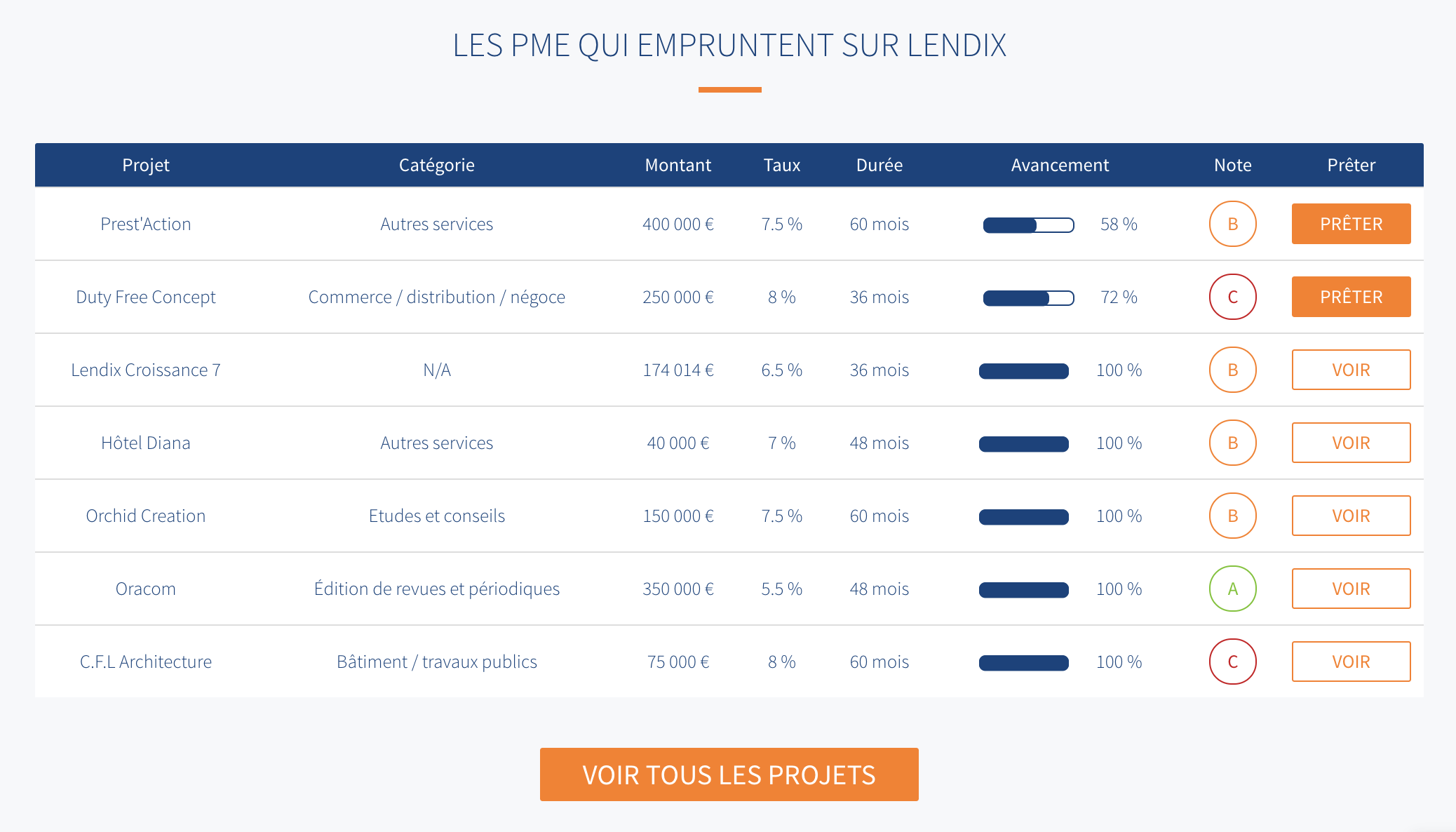
This was great for scannability. However, in order to lend to a company, our users wanted to sympathize with the projects. This table is lacking clear information hierarchy, but above all it needs to showcase the actual projects.
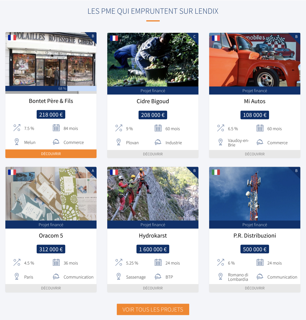
The 2017 solution
Back then I decided to switch to cards. This method shows more about the project while keeping good scannability.
However, I was still growing my design skils back then (aren't we always anyway?) so I thought doing a 2020 retake would be a good exercice.
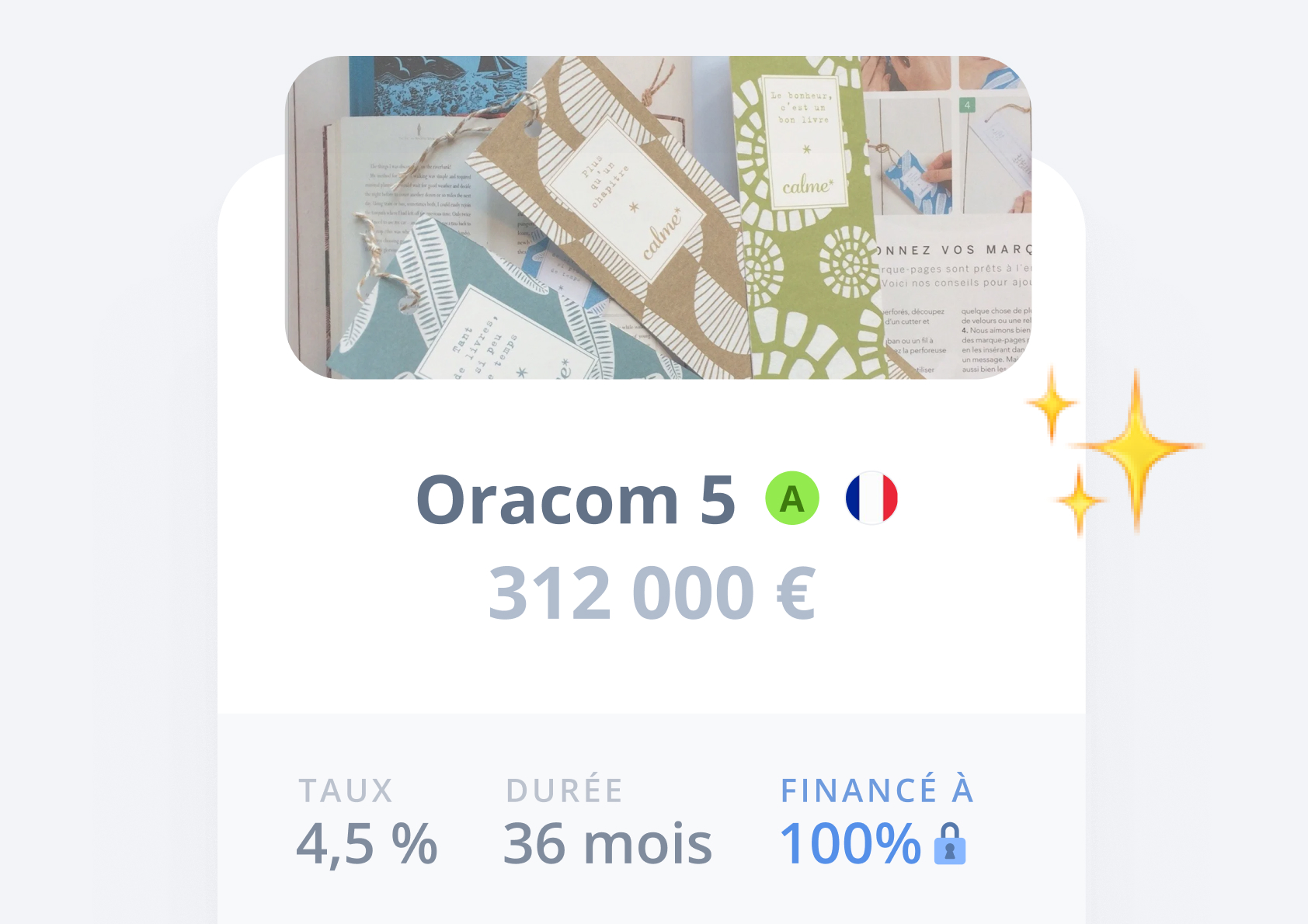
The 2020 retake
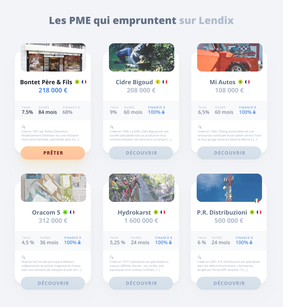
My main focus here was to create a clear hierarchy, unclutter the overall space and bring more differentiation between an active card (you can still lend money to the project) and an inactive card (the project is closed).
I probably will do another retake in 3 years 
Key takeaways
- Design is never done.
- Typography and hierarchy make a huge difference.
- Let things breathe!
Selected Works
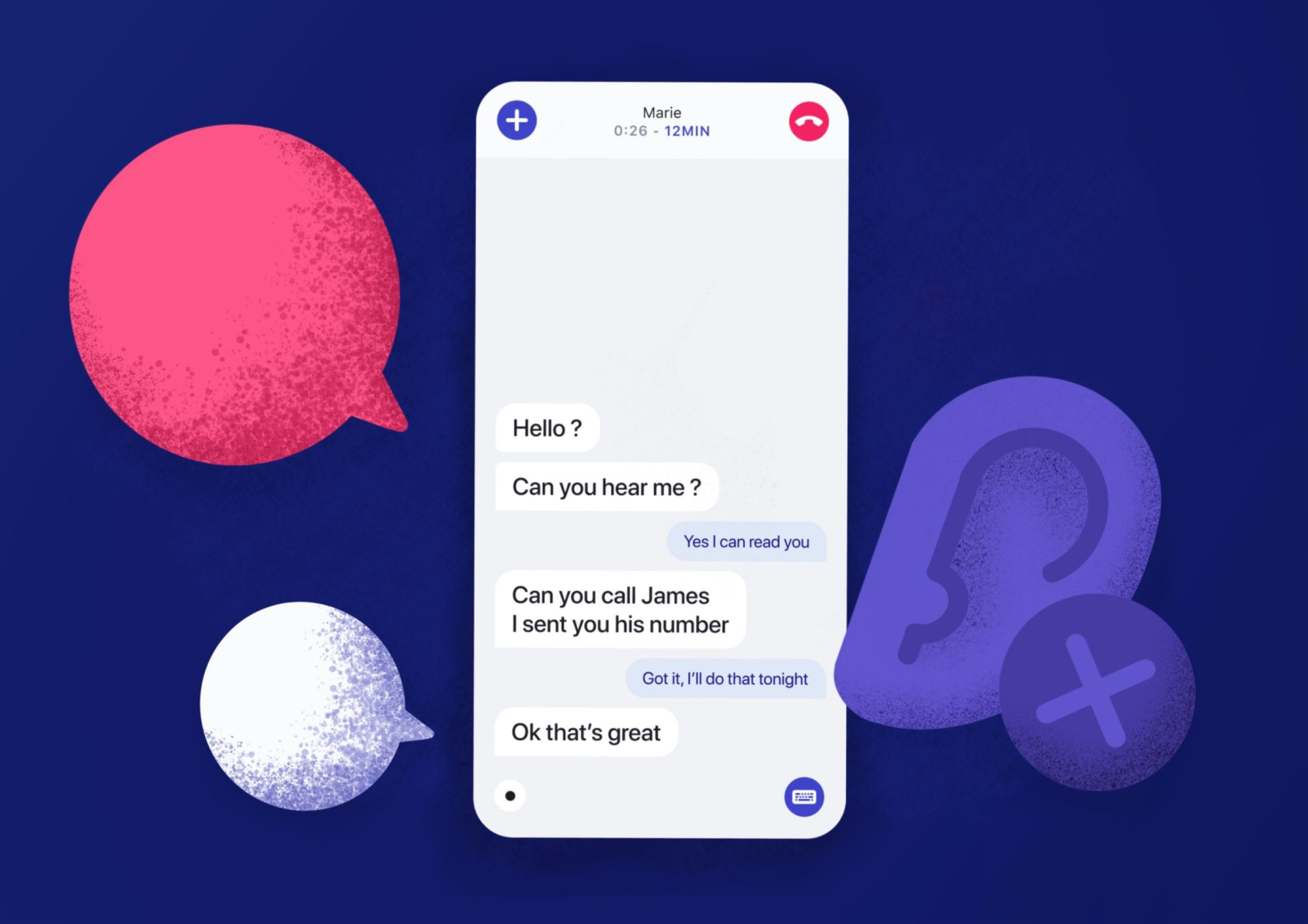
Enhancing deaf people's phone callsUI/UX Design
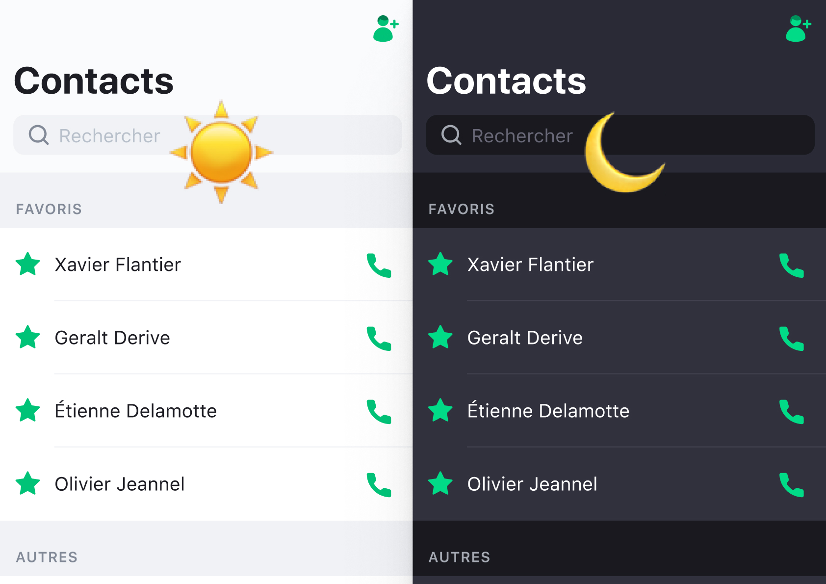
The Dark Mode opportunityDesign system
Duotone custom icon setIcon Design
User tests: a quick guideUser testing
Résumé
Send me an email
hi [at] alexandremallegol [dot] com
Contact me for opportunities or just to say hello 
Alexandre Mallégol © 2020