

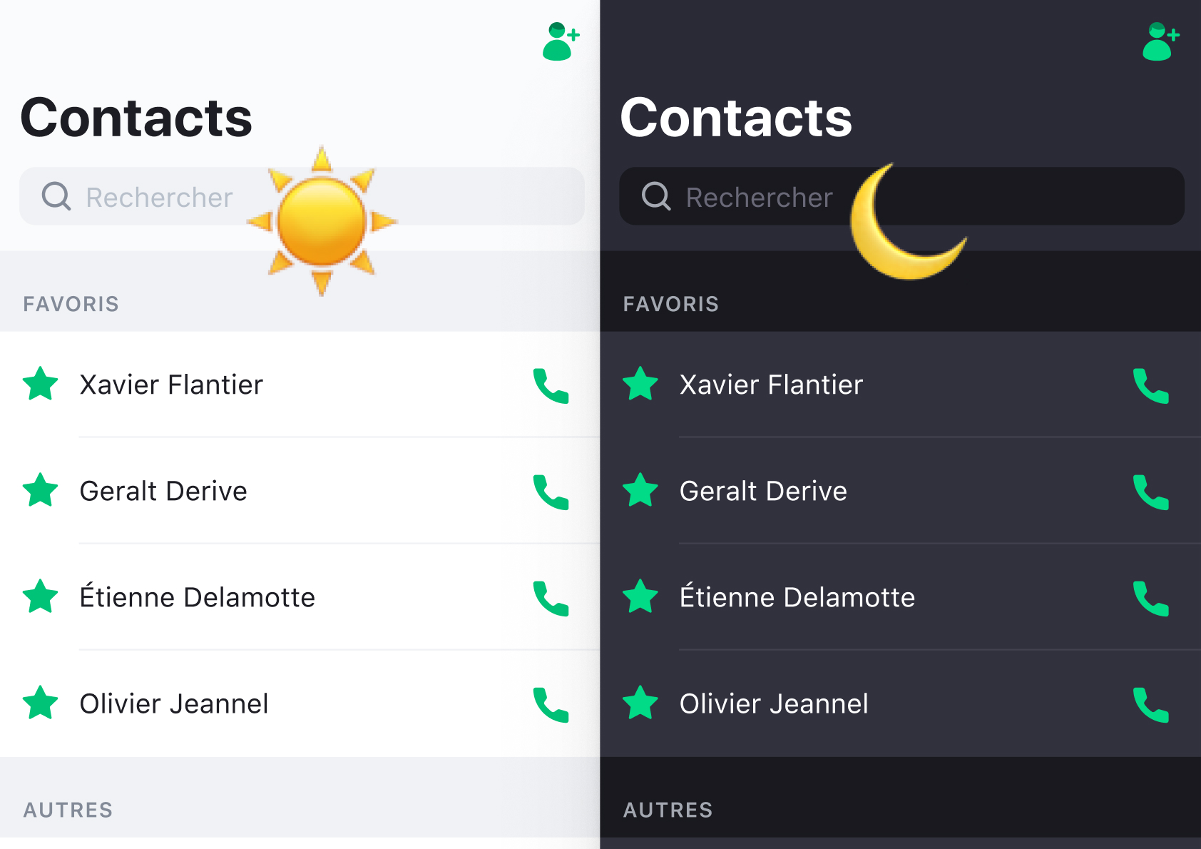
The Dark Mode opportunity
Project context
At the beginning, I did a lot of urgent work for Rogervoice. As we were focusing on matching the market needs, the app became more and more inconsistent : messy typography and lack of unity in colors.
I seized the opportunity of implementing a Dark Mode for our app to harmonize and template our whole UI.
Prerequisites
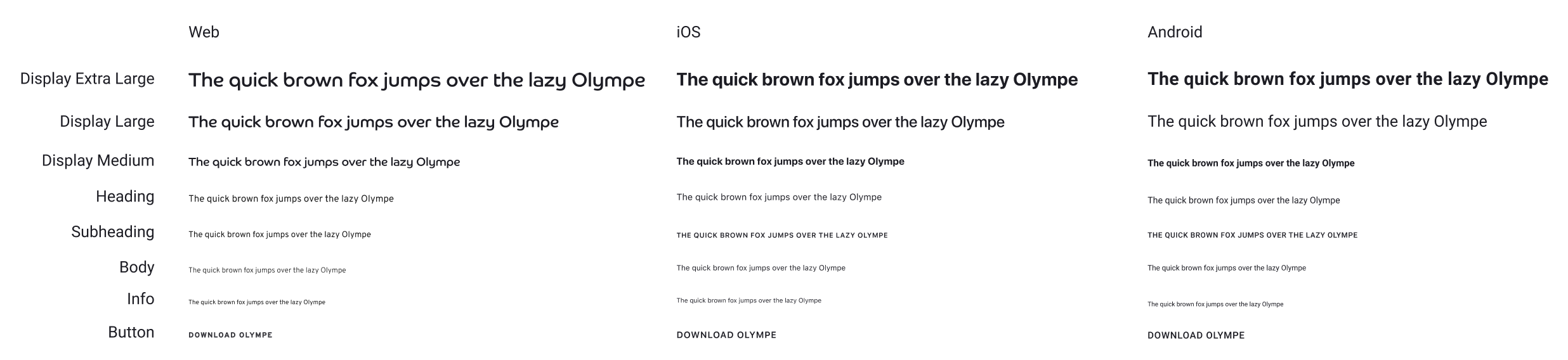
Typography 
We committed to 8 different (and carefully chosen) styles for typography. This avoids a waste of time four our developers in re-implementing very close type properties all the time.
"This should be in Display Medium? There we go, done!"
Figma's components 
They are very powerful. We designed a bank of all the basic components. The idea was to rebuild the whole app in Figma to be sure we weren't missing anything.
Dark Mode: Crafting colors
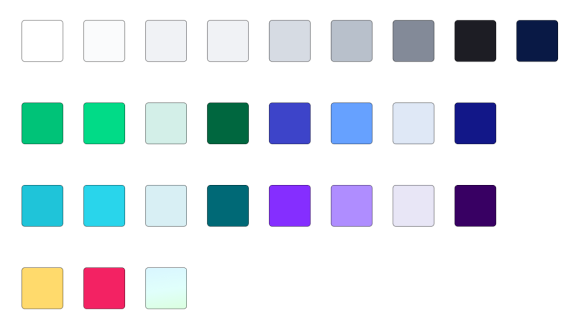
1. Reduce the color used in Light Mode 
We brought that number down to 28. It may seem like a lot but you must have a color for every line, every background, every icon, every typographical hierarchy, etc...
We needed 4 subsets of colors for the call view since every profile type has a different theme (more details in this article).
You can probably choose fewer colors for your app.
2. Be careful when choosing greys 
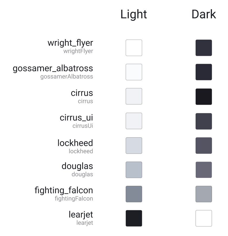
Never go for a not-tinted grey like #BBBBBB. Instead, choose a warm or cool color that matches the tone of your brand and drifts your grey towards that color (for example, we use #B8C0CB, a slightly blue tinted grey). For more tips on this subject, you can check out Steve Schoger's Design tips. It's a gold mine.
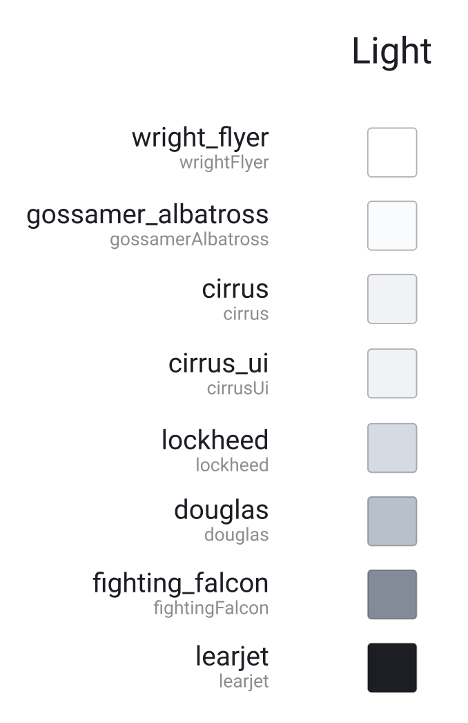
3. Naming colors: variables 
You can't go for something like "Component background" because it will be used in different places. You can't use something like "Main white" either, it will become black as you switch to Dark Mode.
The solution: use placeholders. As a former developer, I just call them variables. Once the variable is named, it can contain any color. Your developers don't even have to worry about the actual color in any theming scheme.
Here's how we named some of ours (we chose plane names in tribute to Rogervoice's logo) :
4. Let the magic happen 
Once our developers implemented the right color placeholder for every element in Light Mode, we only had to specify the color values in Dark Mode and here we go!
One last quick tip 
The Light theme's whitest white shouldn't be the Dark theme's darkest black. You should invert those colors to preserve visual hierarchy, that's how our brains work!
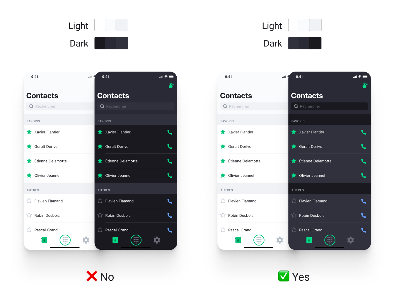
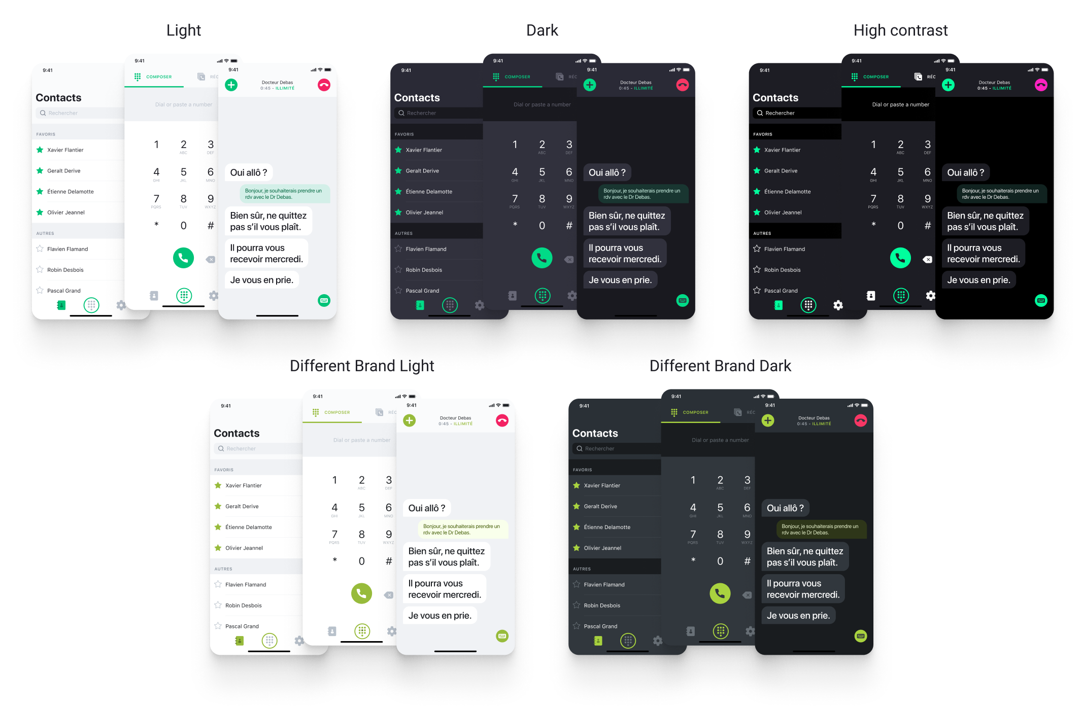
The result: A refined app, ready for any theming scheme!
We can now easily generate any theme with very little implementation from the developers.
If you use Figma, you should check out the plugin Themer. You will be able to switch themes with one click 
Key takeaways
- Choosing colors is a never-ending, very fun process. Put some time into it.
- Having a clear system in place is a huge plus for the engineers.
- Our designs have never been so consistent since!
Selected Works
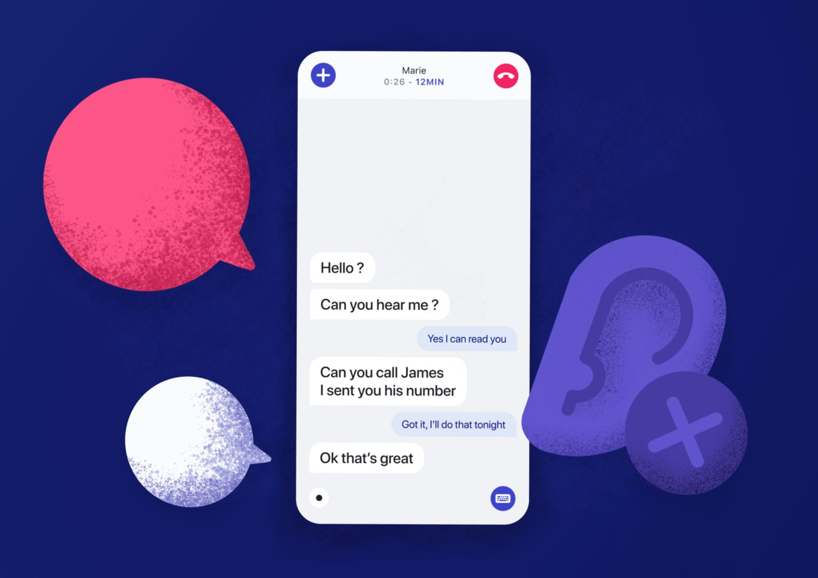
Enhancing deaf people's phone callsUI/UX Design
Duotone custom icon setIcon Design
From table to cards, a retakeWeb design
User tests: a quick guideUser testing
Résumé
Send me an email
hi [at] alexandremallegol [dot] com
Contact me for opportunities or just to say hello 
Alexandre Mallégol © 2020