

Enhancing deaf people's phone calls
Project context
As the Lead Product Designer at Rogervoice, my goal is to maximise usability for our app. The experience of having phone calls by reading live transcription is critical for deaf people.
Therefore the call view is one of the most important.
Our text-to-speech system had proven to be effective, but the overall experience wasn't quite on point yet.
The problems
Here are some of the main problems I identified before conducting this redesign.
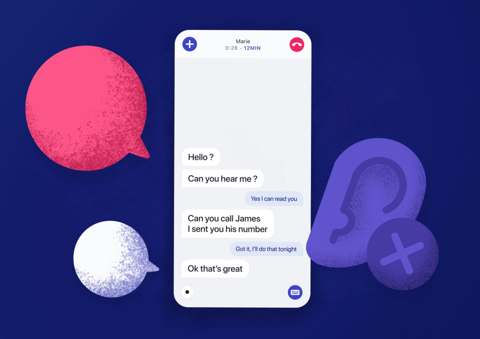
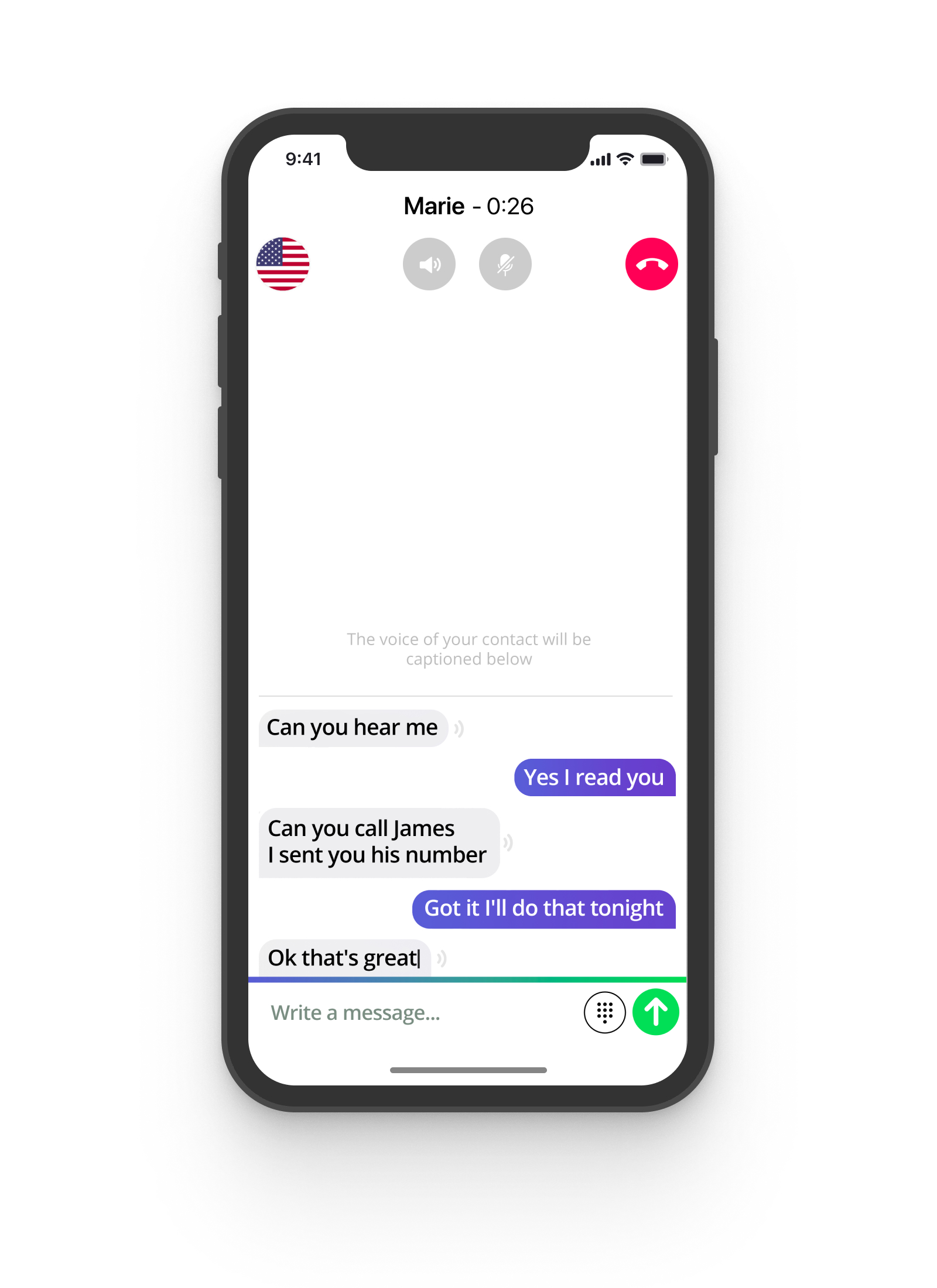
- Lack of readability
- Cluttered header and footer
- Missing critical informations (remaining credit & sound wave)
- Lack of overall modernity
The solutions
Improving readability 
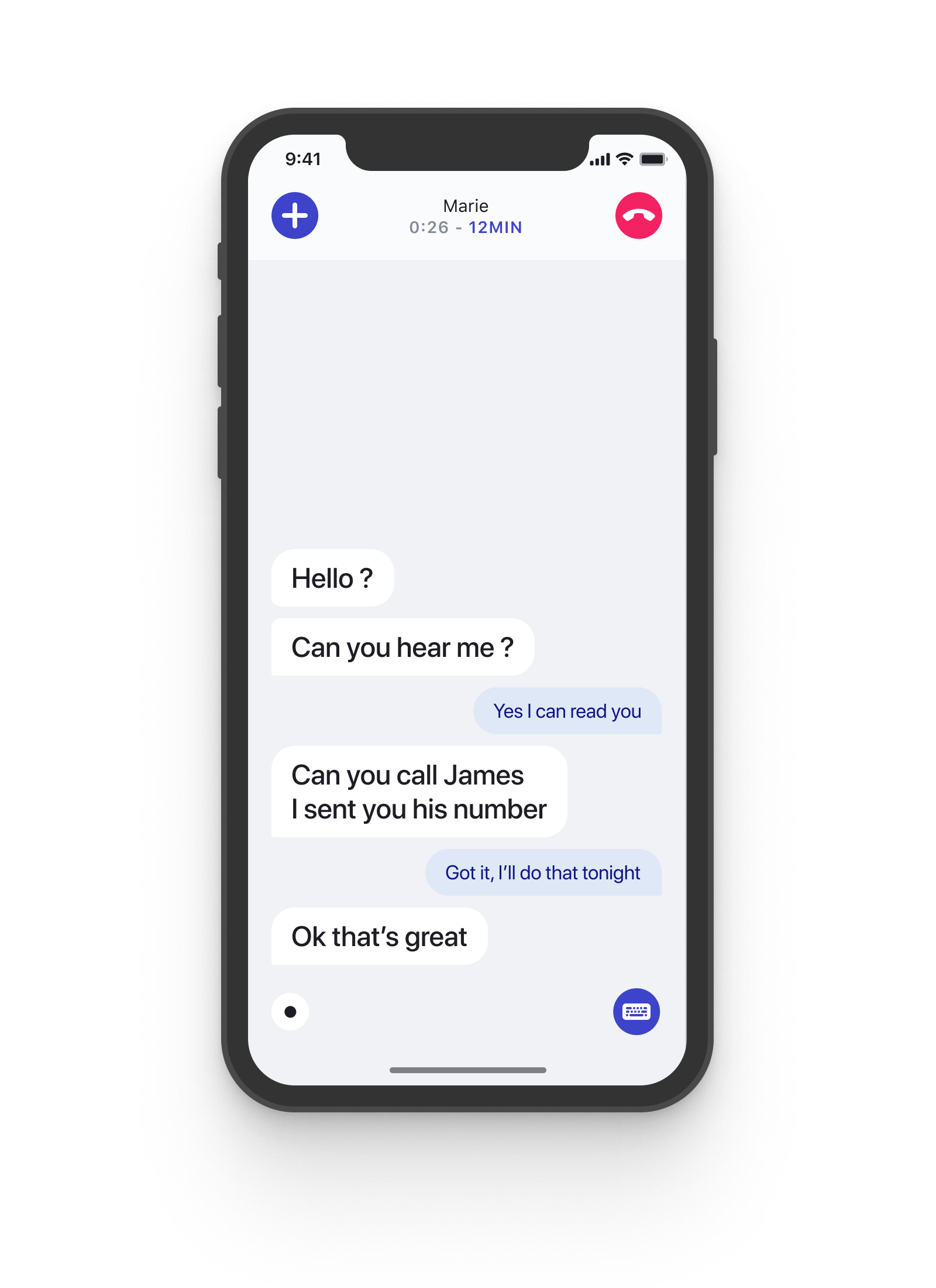
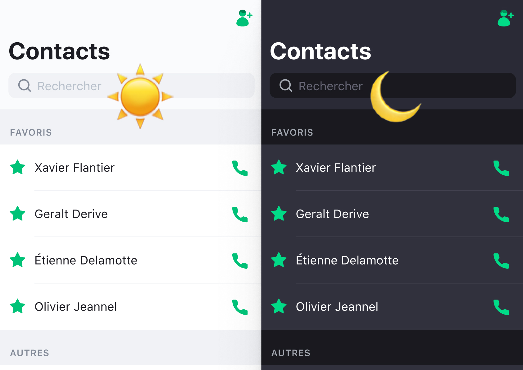
We removed the background gradient of the bubbles and introduced better hierarchy with carefully chosen typography.
The speaker's bubbles (left) are very important for the deaf person to read, whereas his own bubbles (right) are there for spell checking purposes only.
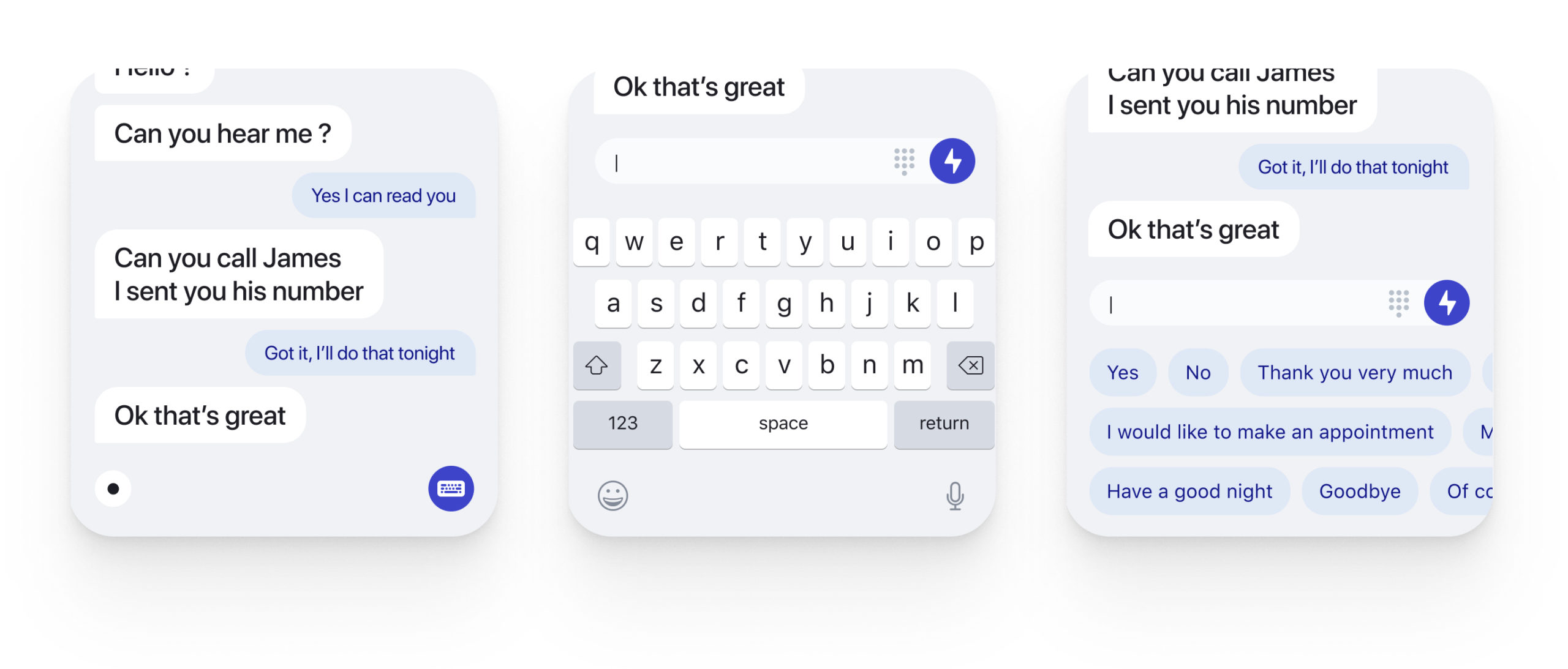
Uncluttering the interface and clarifying the controls 
Most deaf people aren't mute, so the text-to-speech input is a secondary option for our users. I still wanted to clearly provide the option, but the emphasis needed to be brought down. That's why I created the bottom right button.
The same goes for the secondary controls at the top, not used by most of our users. They were regrouped inside a "+" sub-menu.
Adding information 
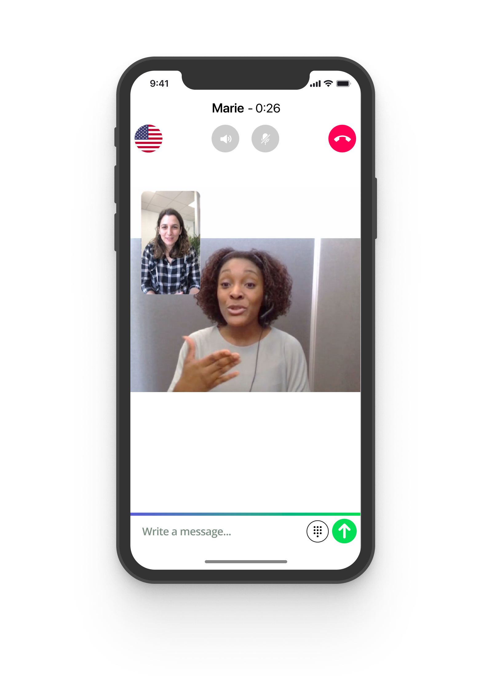
The gained space is used to add information : the remaining credit (colored blue at the top center) and the speaker's sound wave (white wave at the bottom left-hand corner).
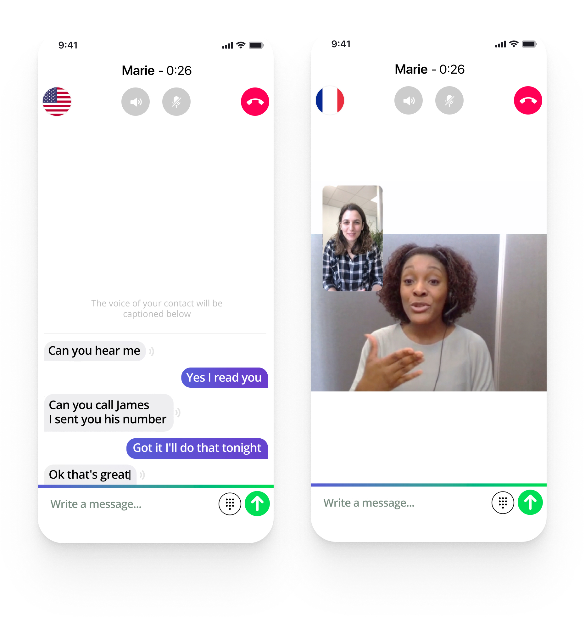
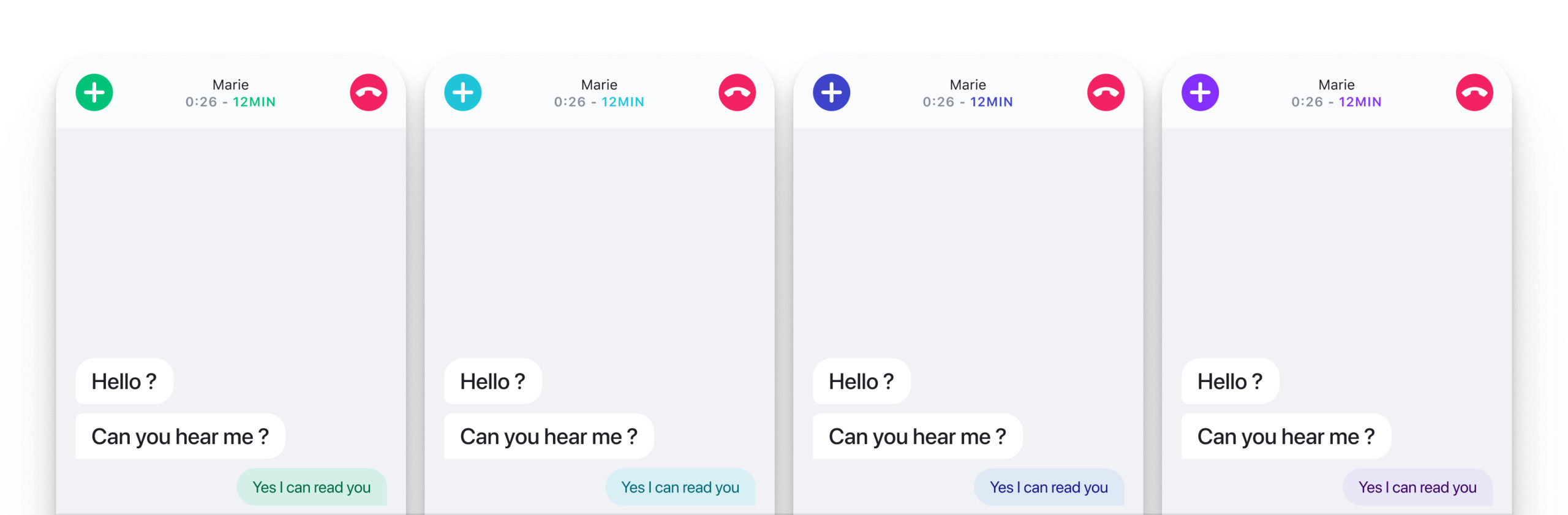
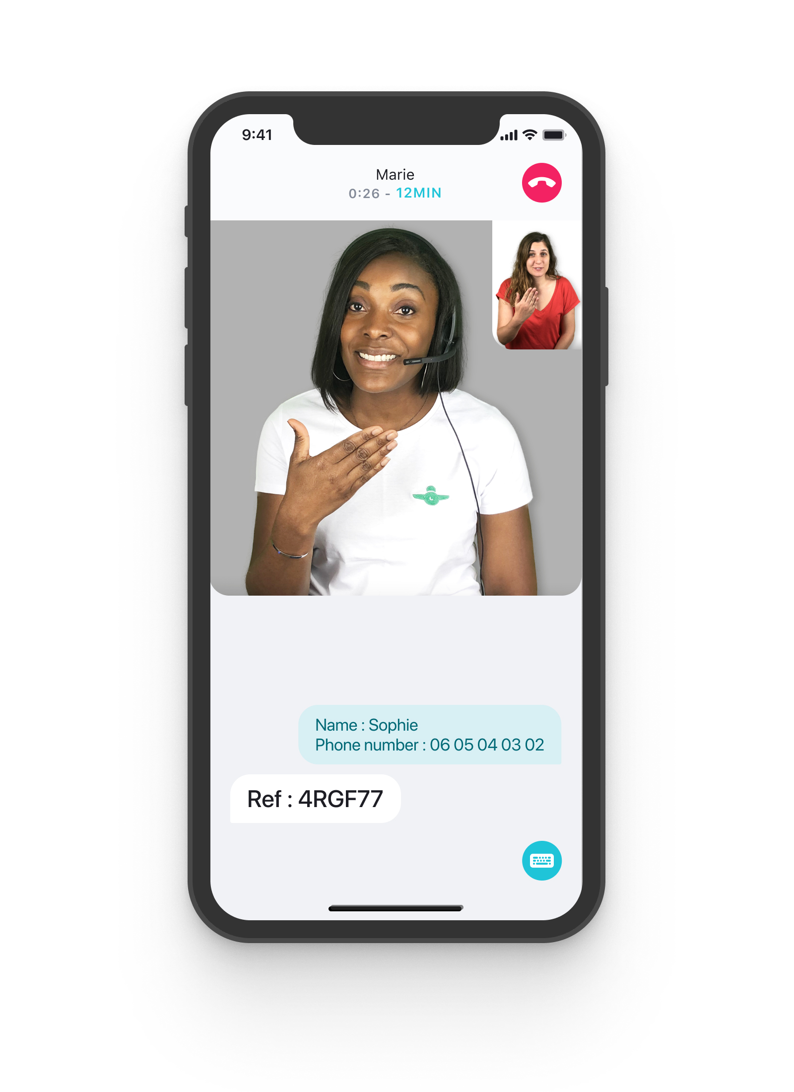
Color templating 
This new interface was designed to support multiple themes (to represent different call modes). For more information, you can check out this article about the Design System.
The result : before / after
Key takeaways
As always, simplicity is the key.
Typography and hierarchy make a huge difference.
Three months after the release : the average call rating went from 3.9 to 4.2 / 5. It worked 
Selected Works
The Dark Mode opportunityDesign system
Duotone custom icon setIcon Design
From table to cards, a retakeWeb design
User tests: a quick guideUser testing
Résumé
Send me an email
hi [at] alexandremallegol [dot] com
Contact me for opportunities or just to say hello 
Alexandre Mallégol © 2020